
I was responsible for conceptualising and creating the branding for a global clinical drug trial.
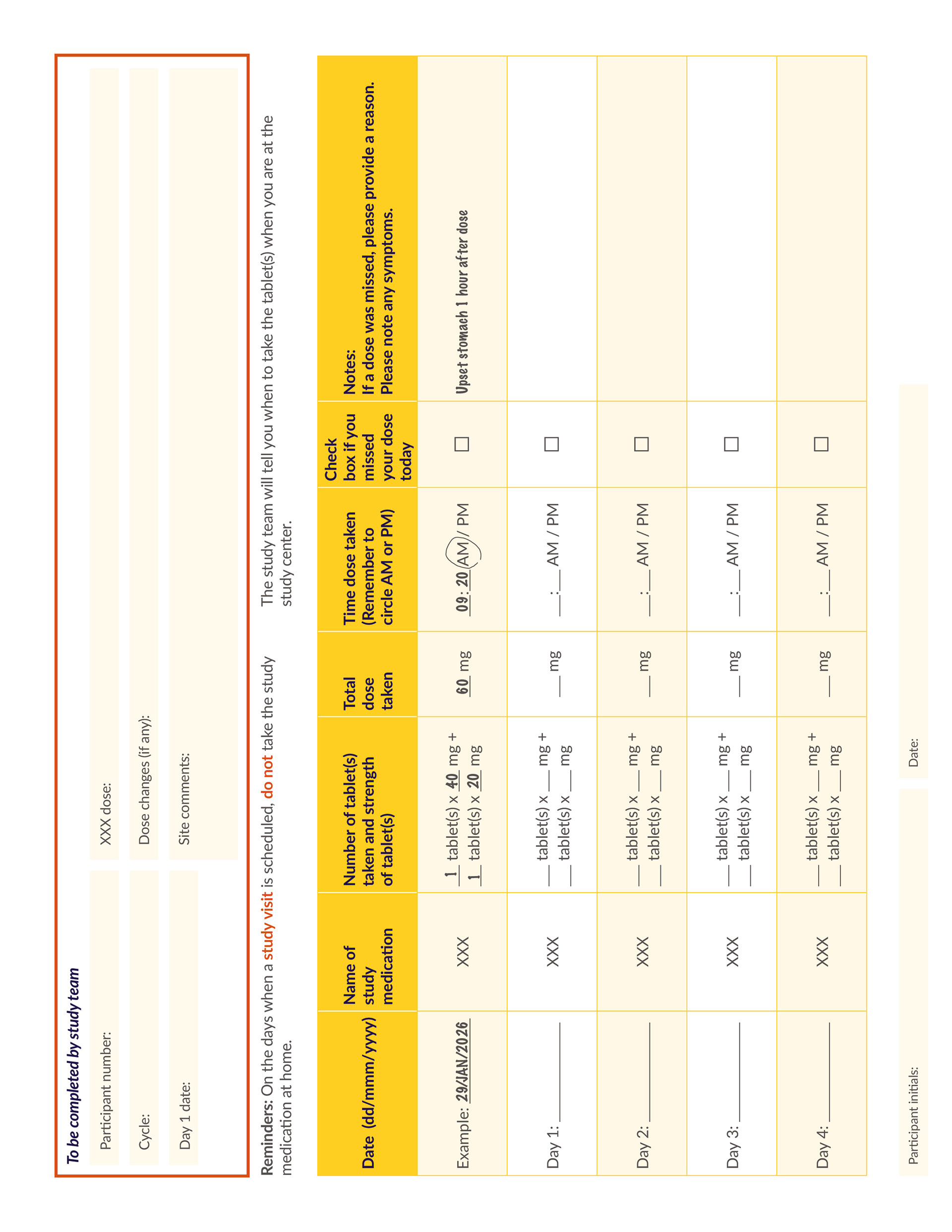
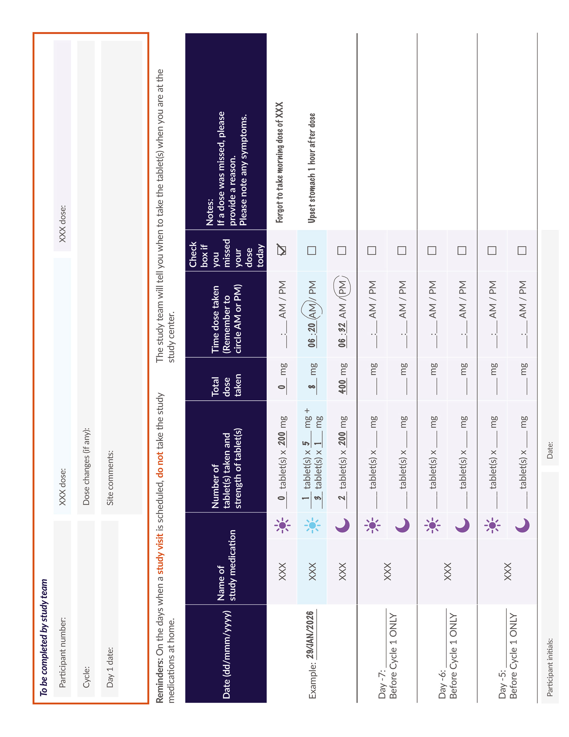
The primary task was designing four participant diaries which were to be used by study participants to record medication use, symptoms and study visits over the course of the trial. As participants would be referring to it throughout the study, it needed to support understanding and encourage regular use.
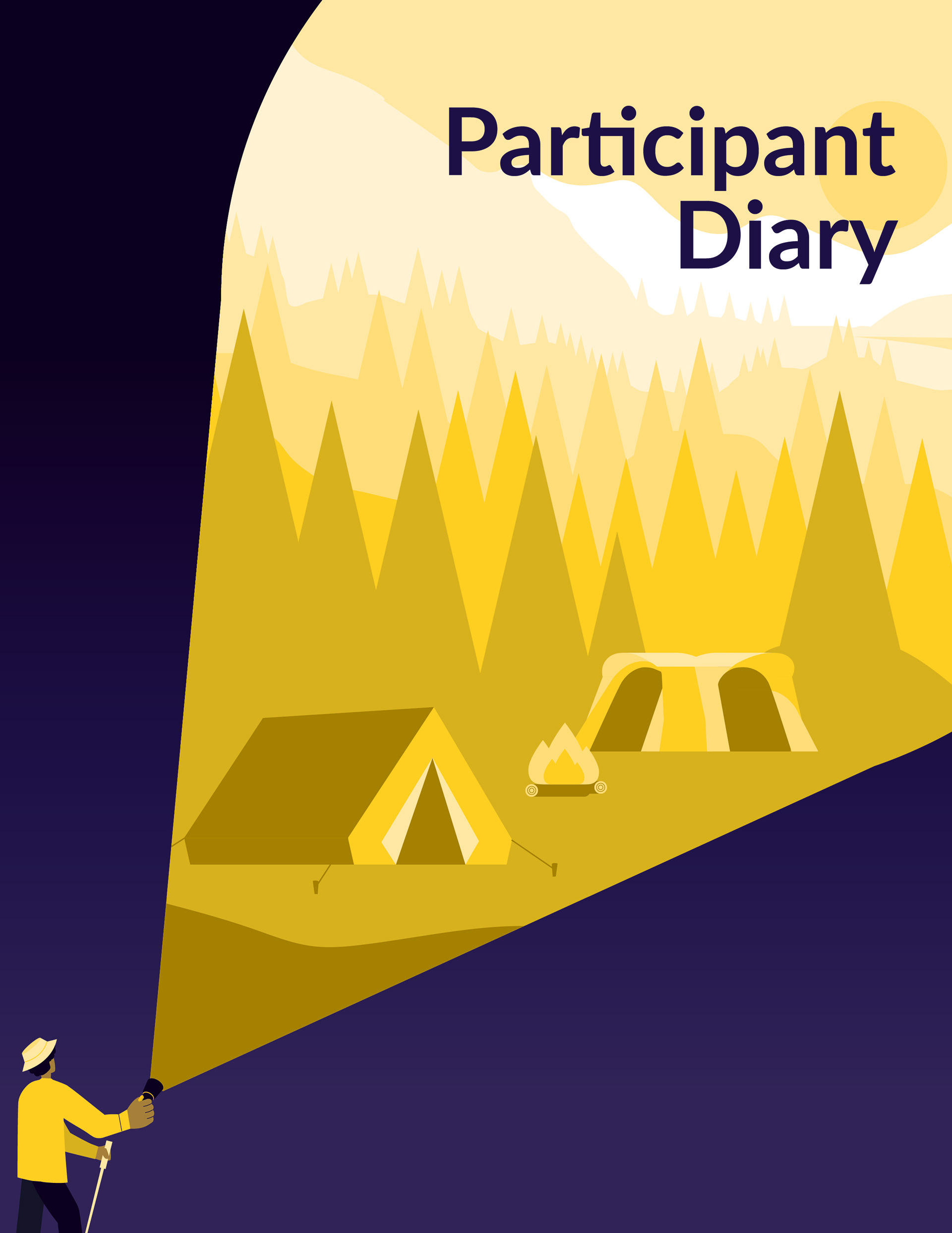
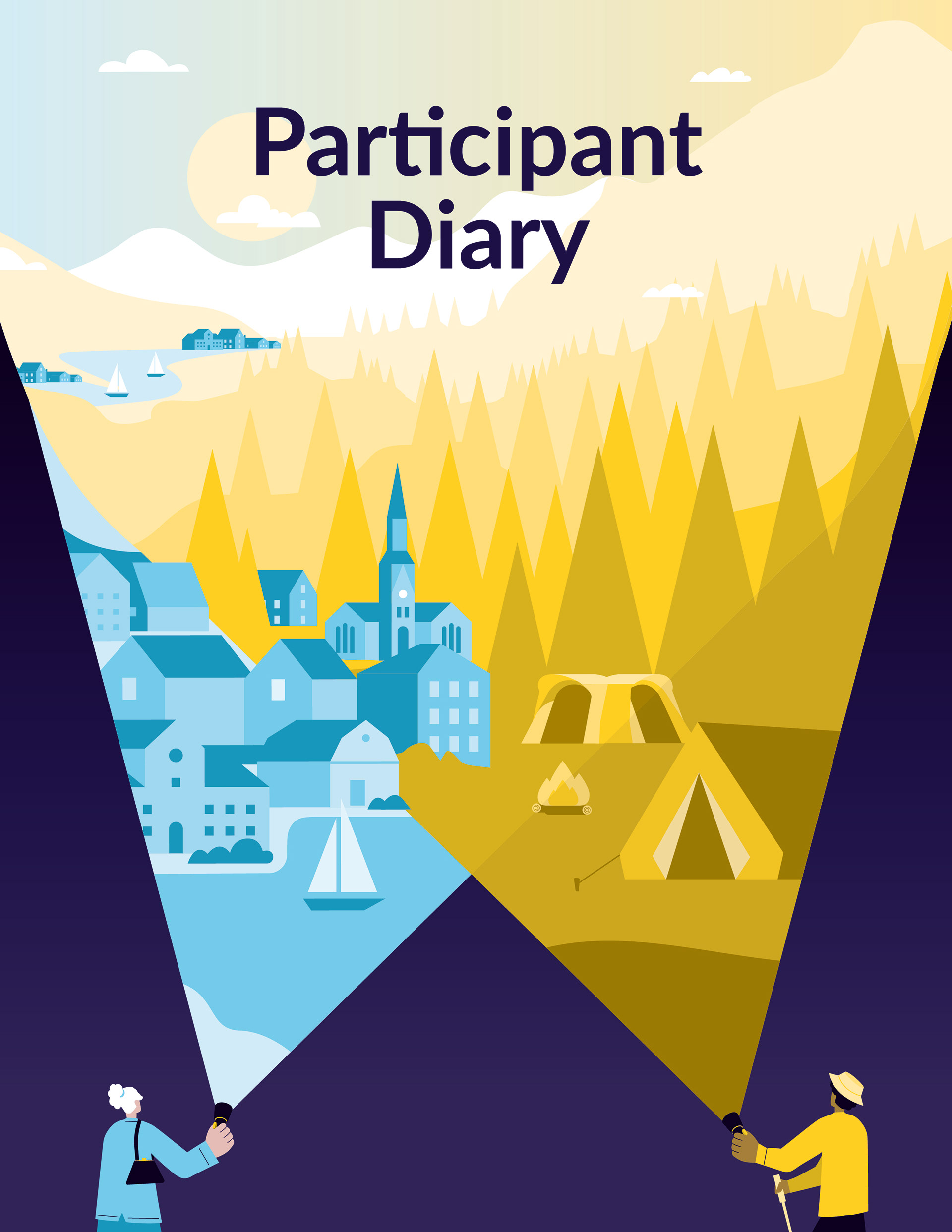
My aim was not only to organise complex information clearly, but also to create a document that felt reassuring rather than overwhelming. Clinical documents can often be dense, text-heavy and full of medical jargon, so making participants feel comfortable and confident whilst using the diaries was paramount for both myself and the client. So, instead of relying solely on typography and layout, I developed an illustrated concept that introduced warmth and personality while reinforcing the purpose of the study.
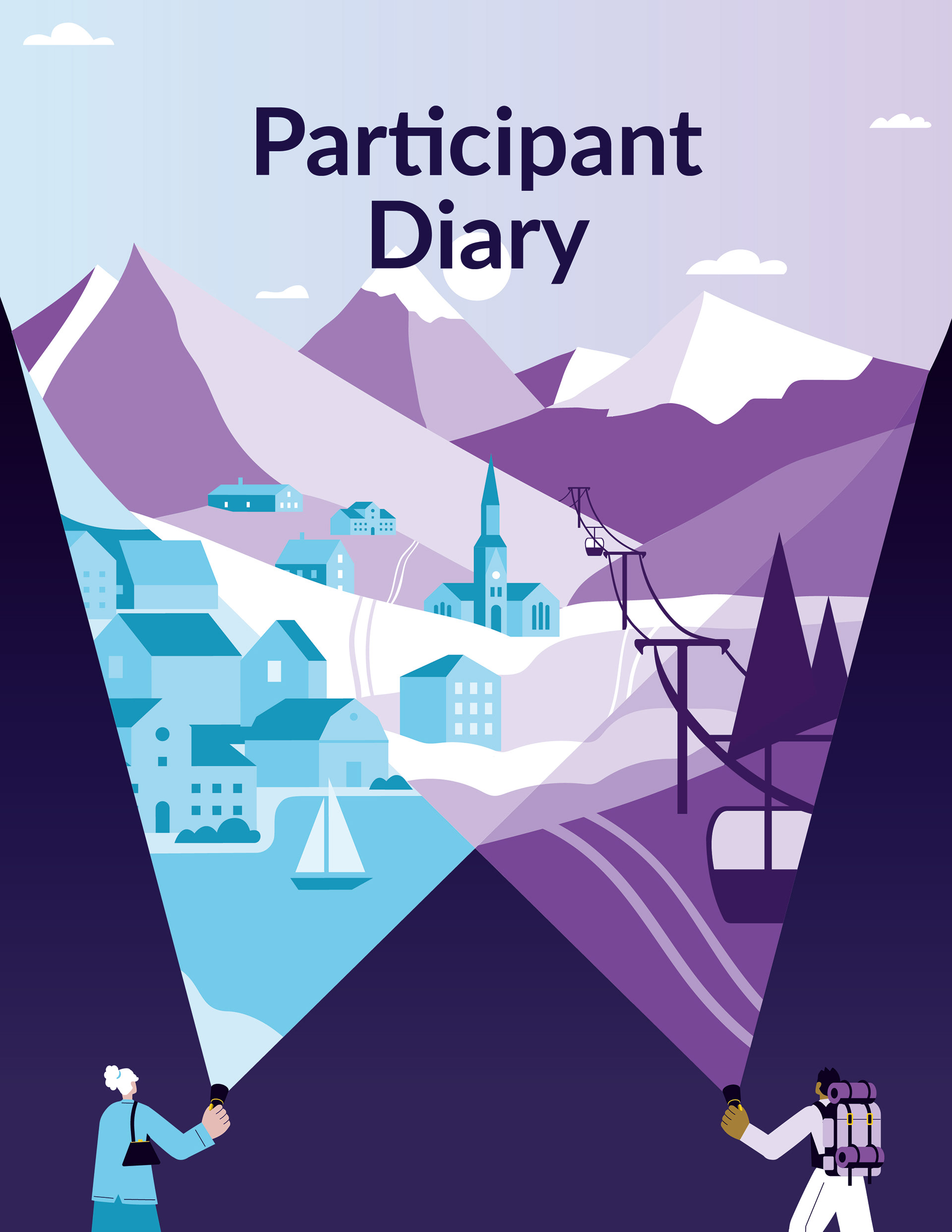
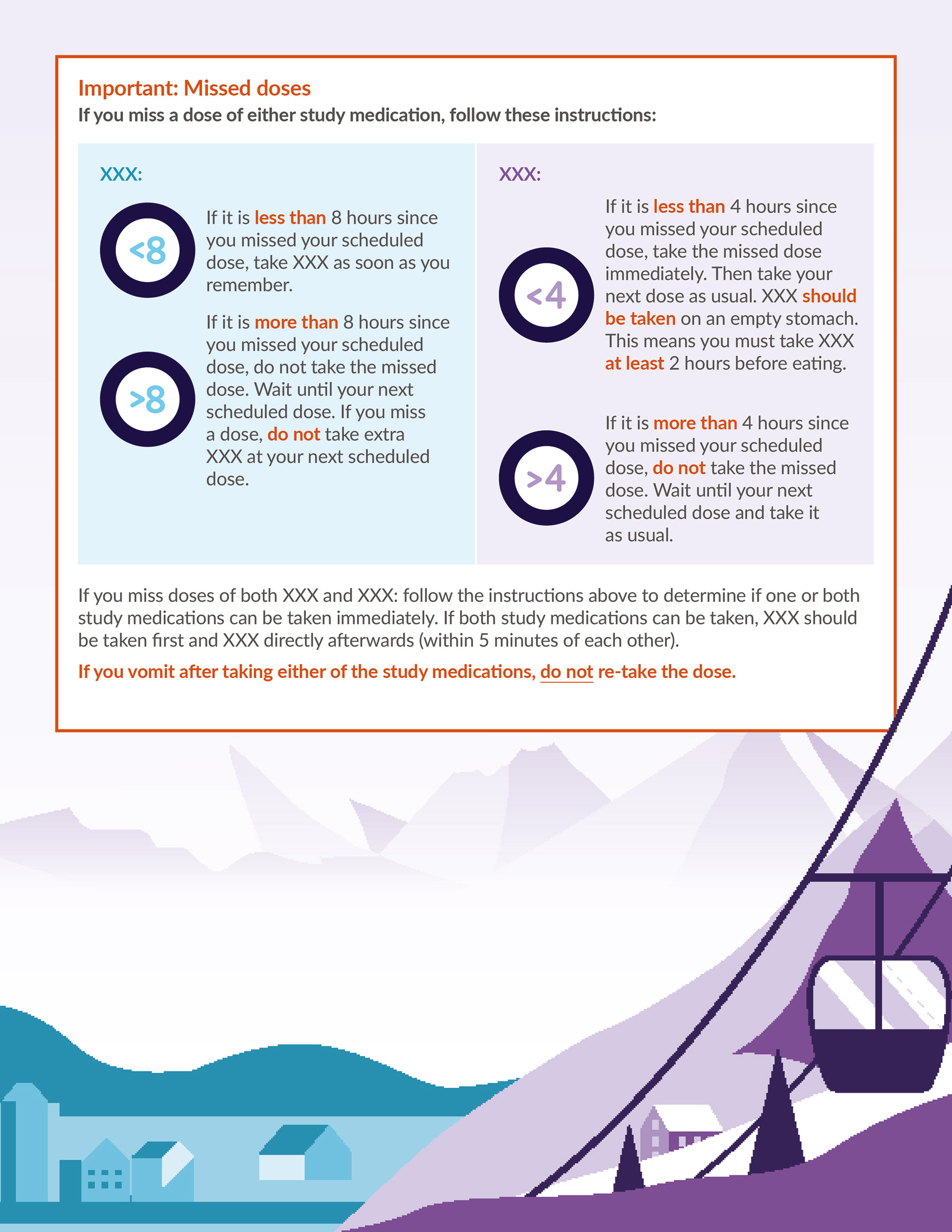
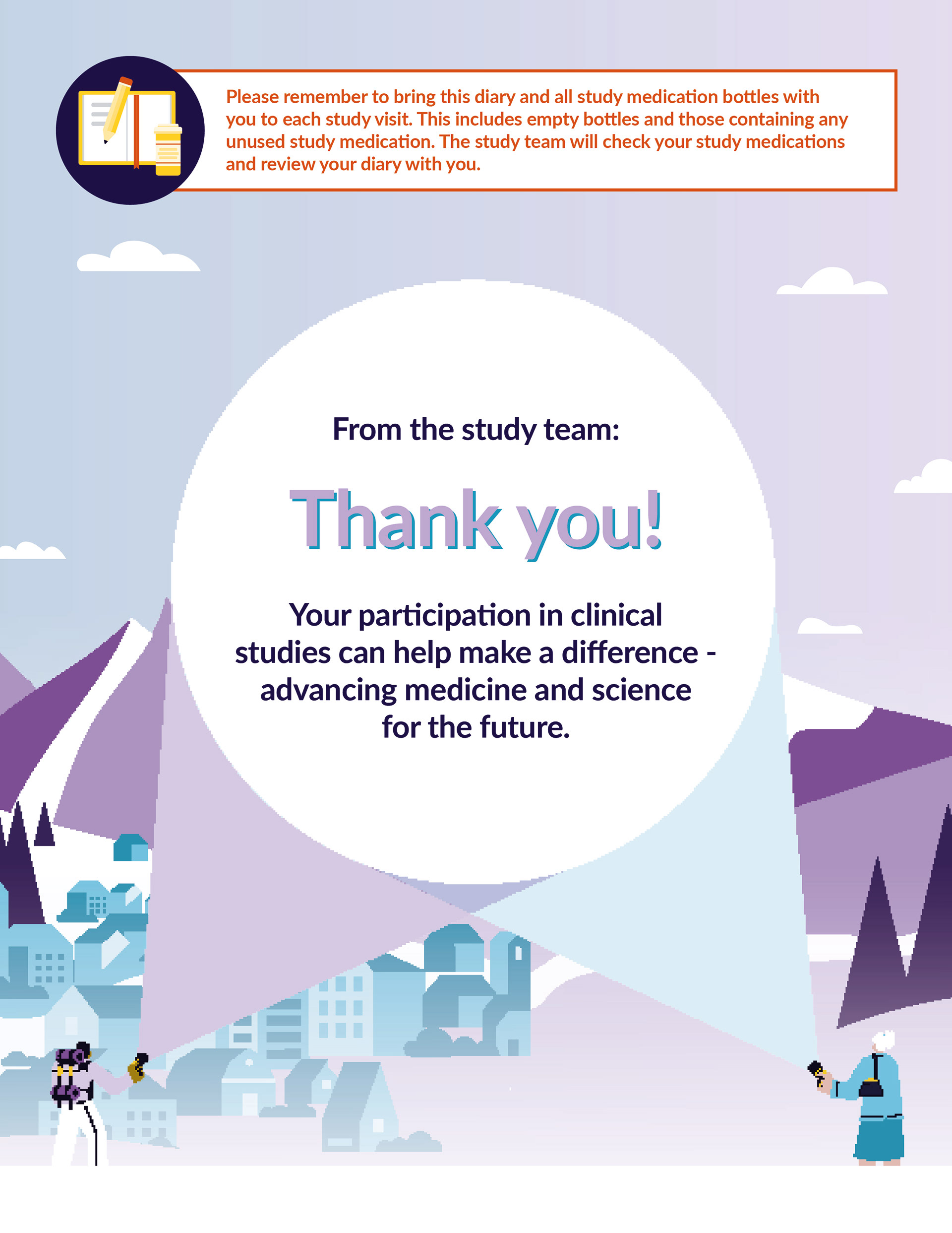
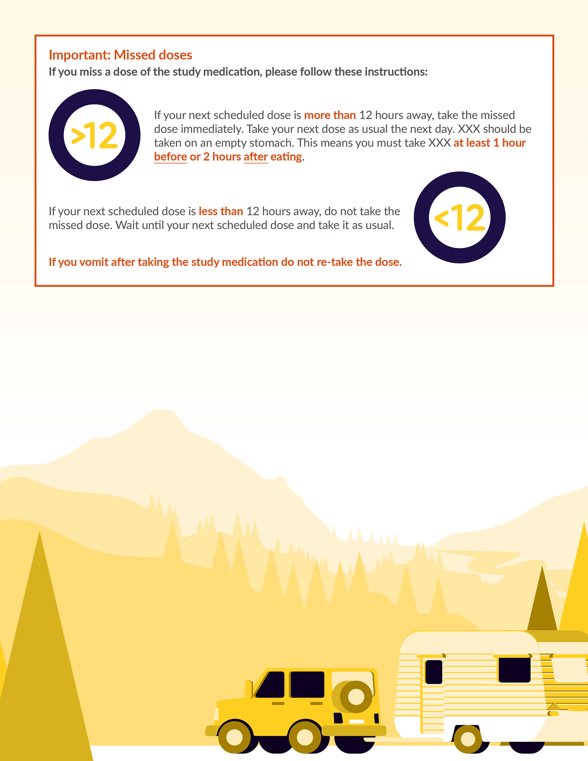
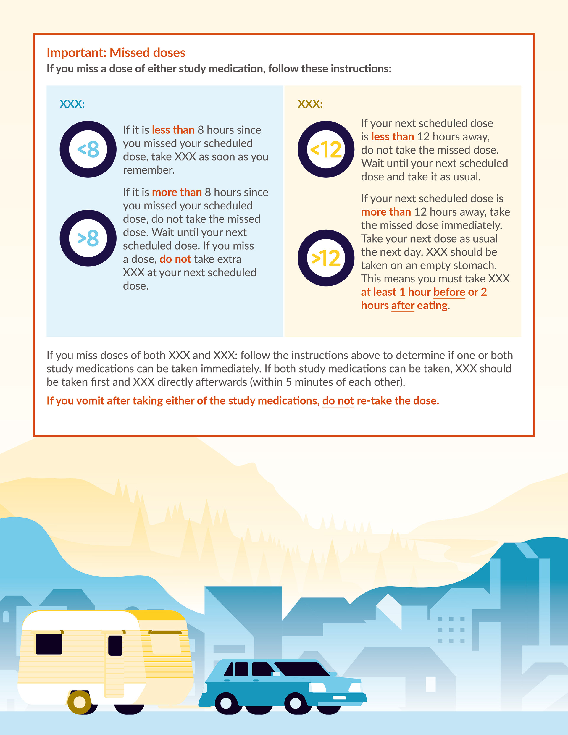
As the trial involved three separate study drugs, which could be combined into four different variations. I created three distinct illustrated environments: a purple mountain landscape representing one drug, a blue townscape representing another drug and a yellow forest landscape representing the other. Throughout the diaries the scenes are revealed through the beam of a flashlight. The flashlight became the central visual metaphor for the diaries. I wanted it to symbolise participants navigating their own journey through the clinical trial, providing a sense of guidance, reassurance and light in what can often feel like an uncertain time. This concept was then carried throughout the diaries, creating four consistent visual identities.
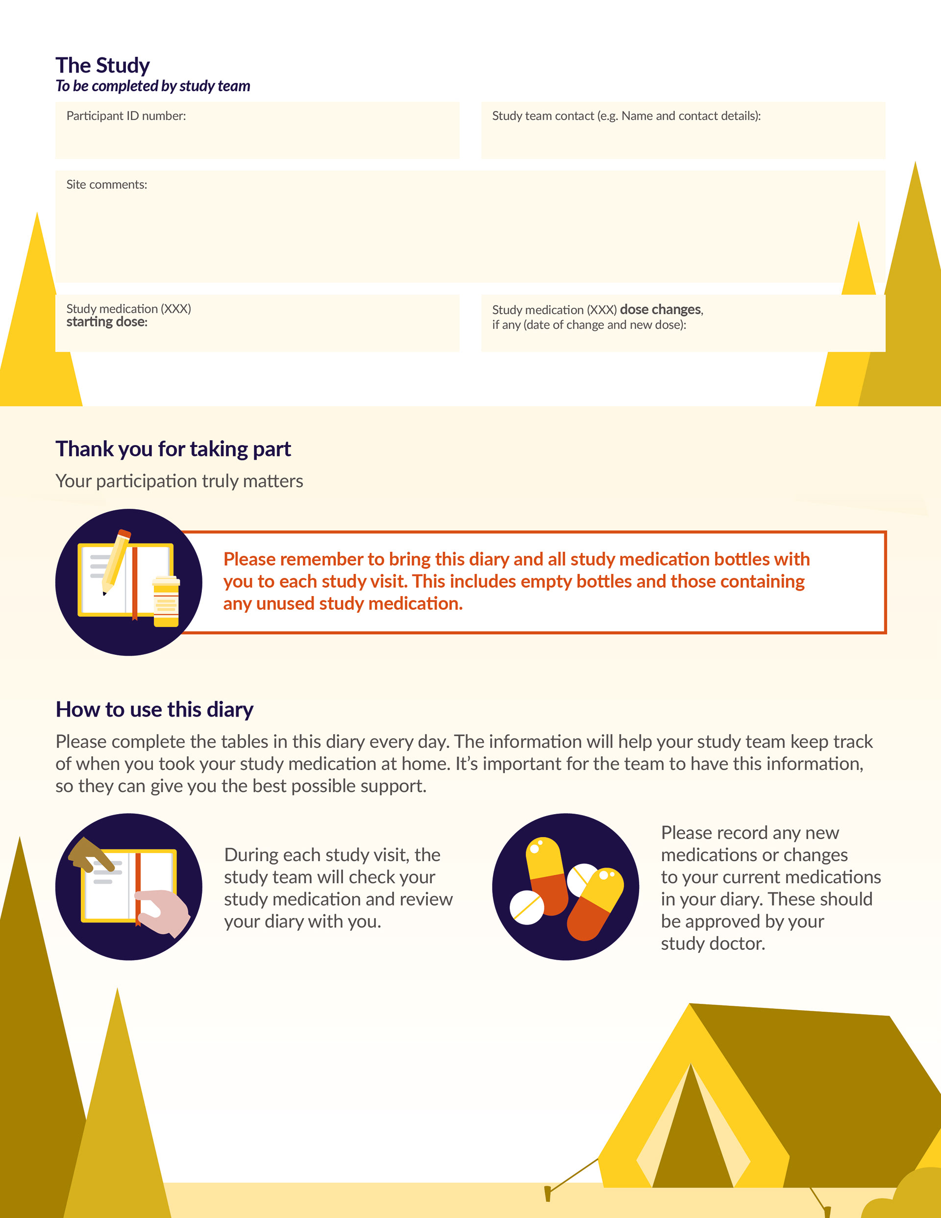
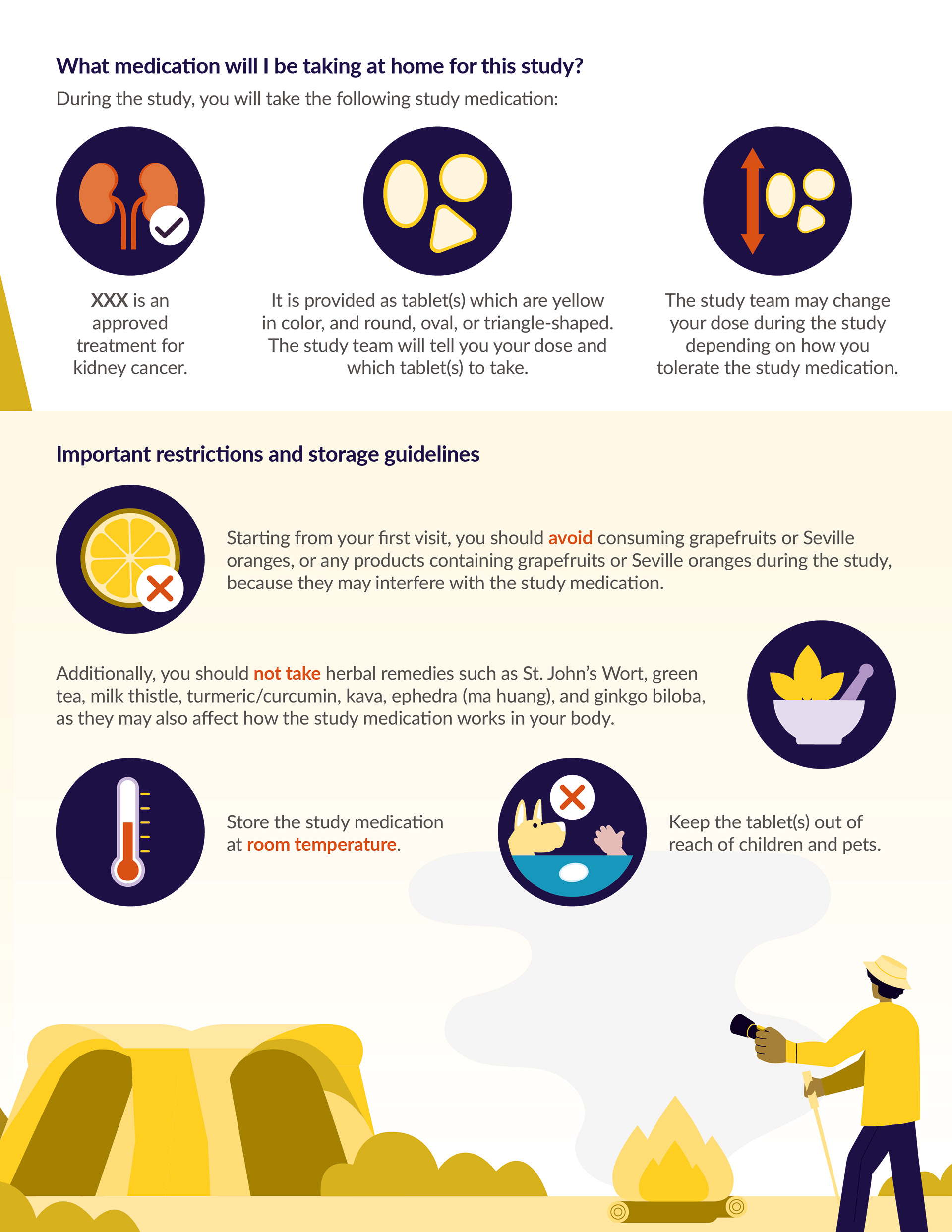
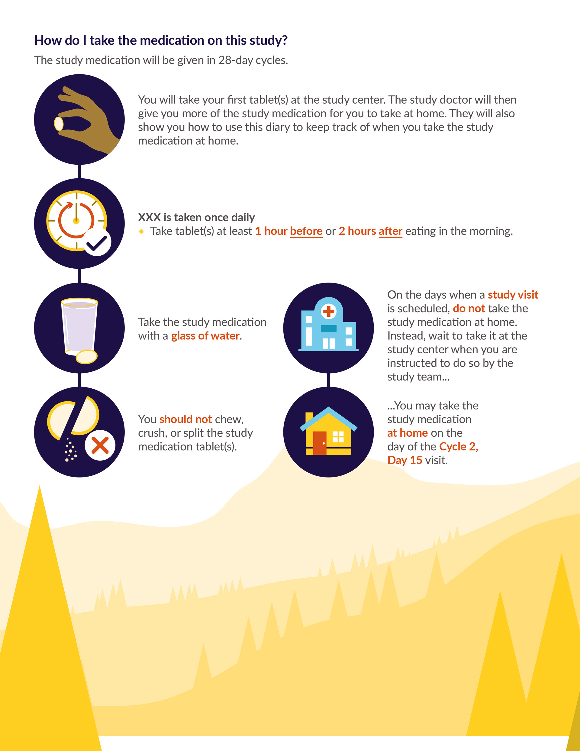
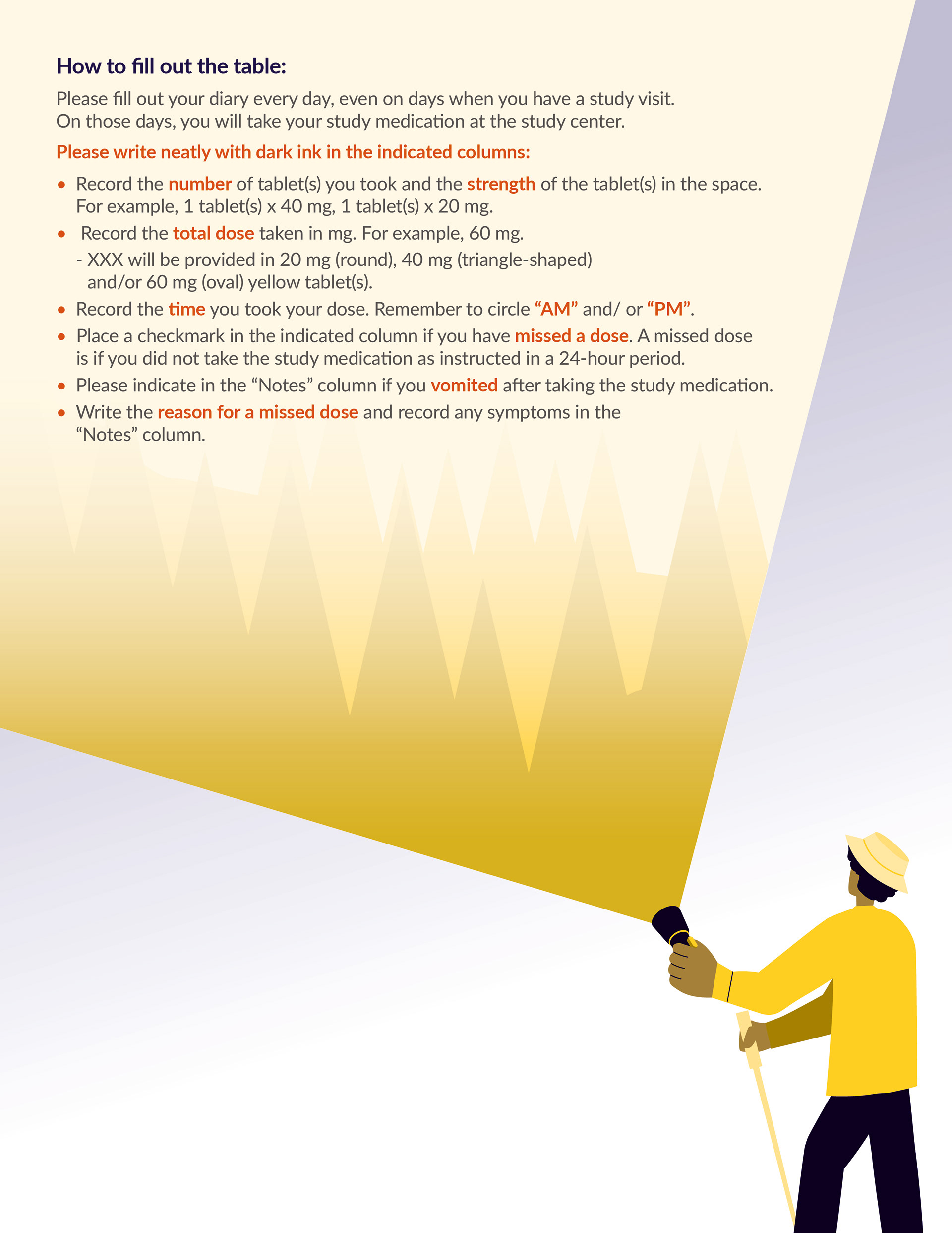
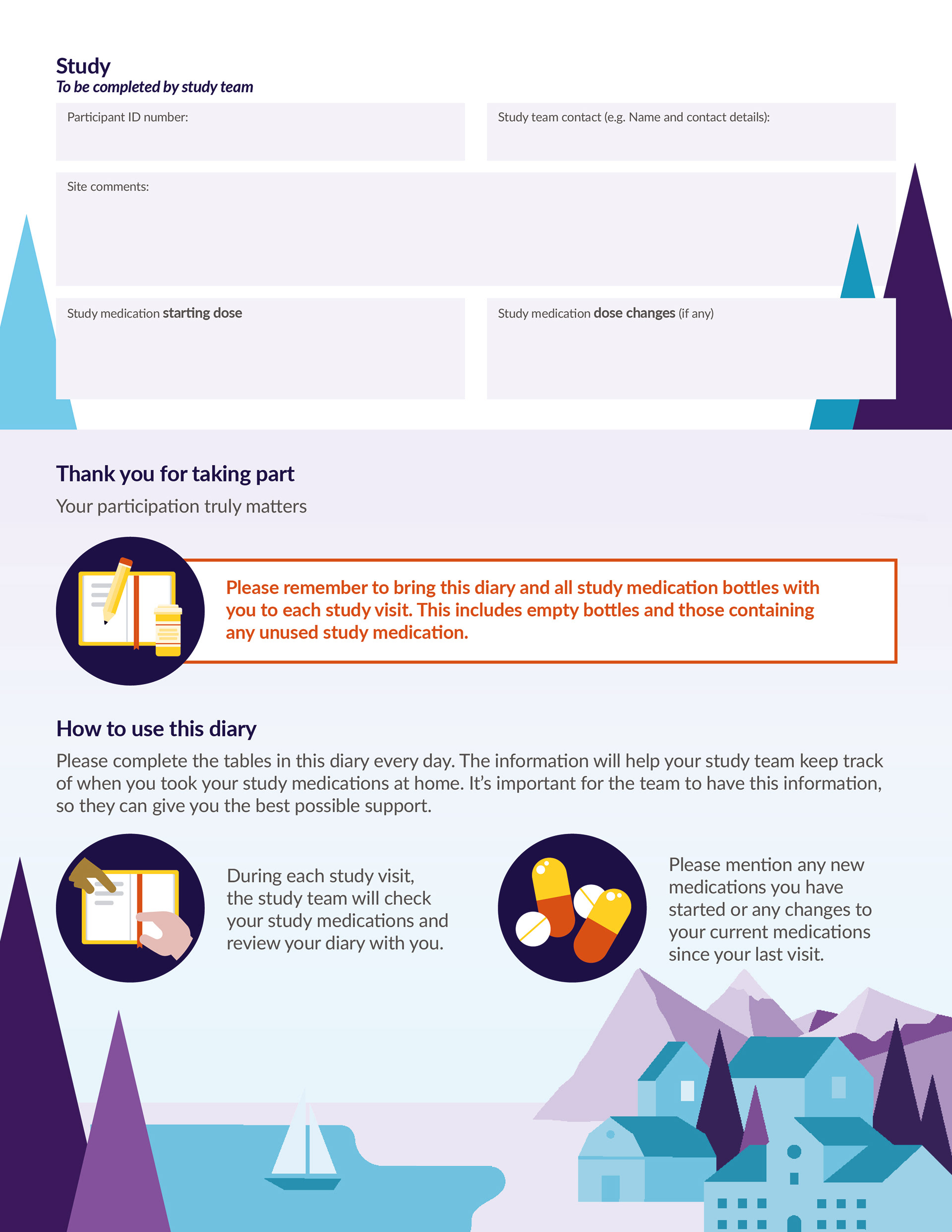
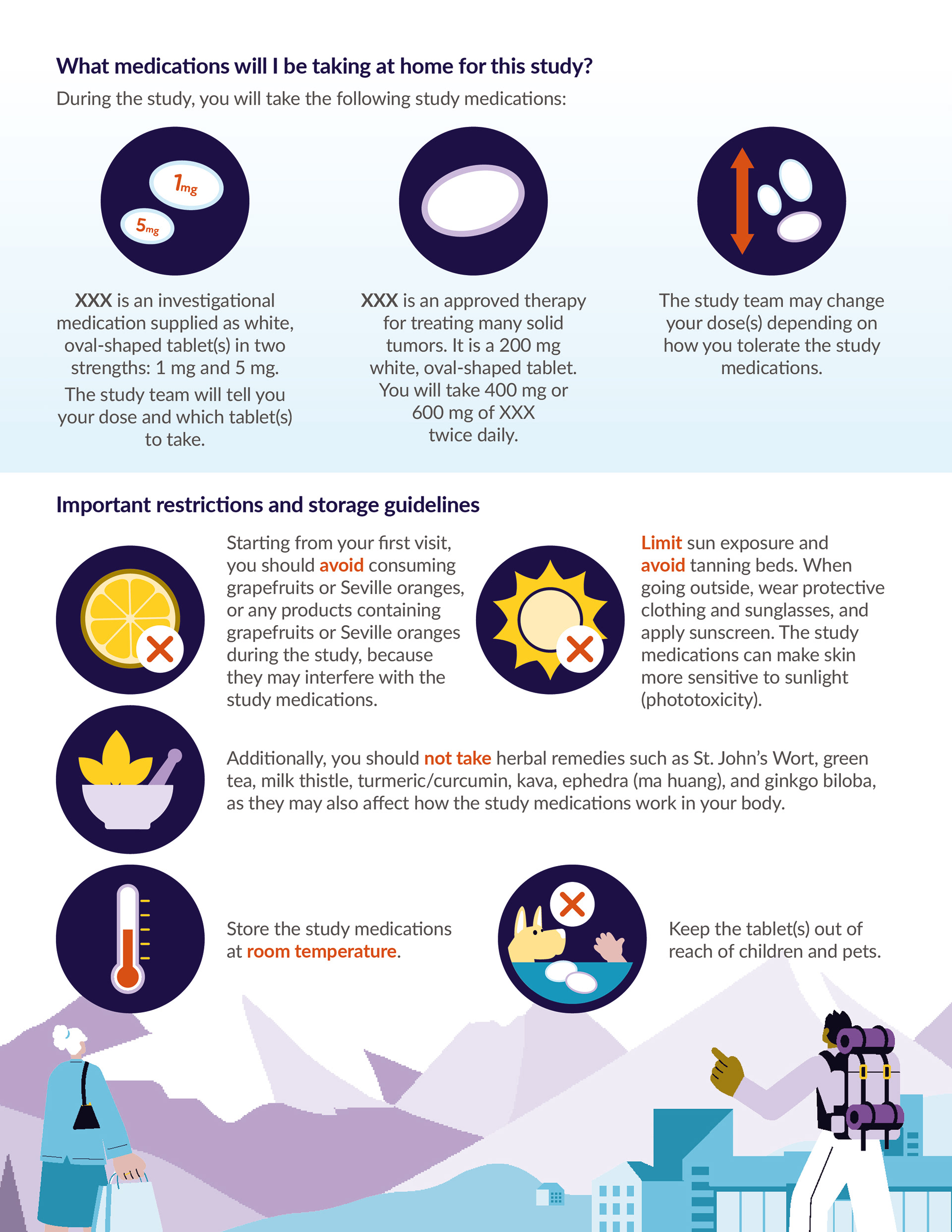
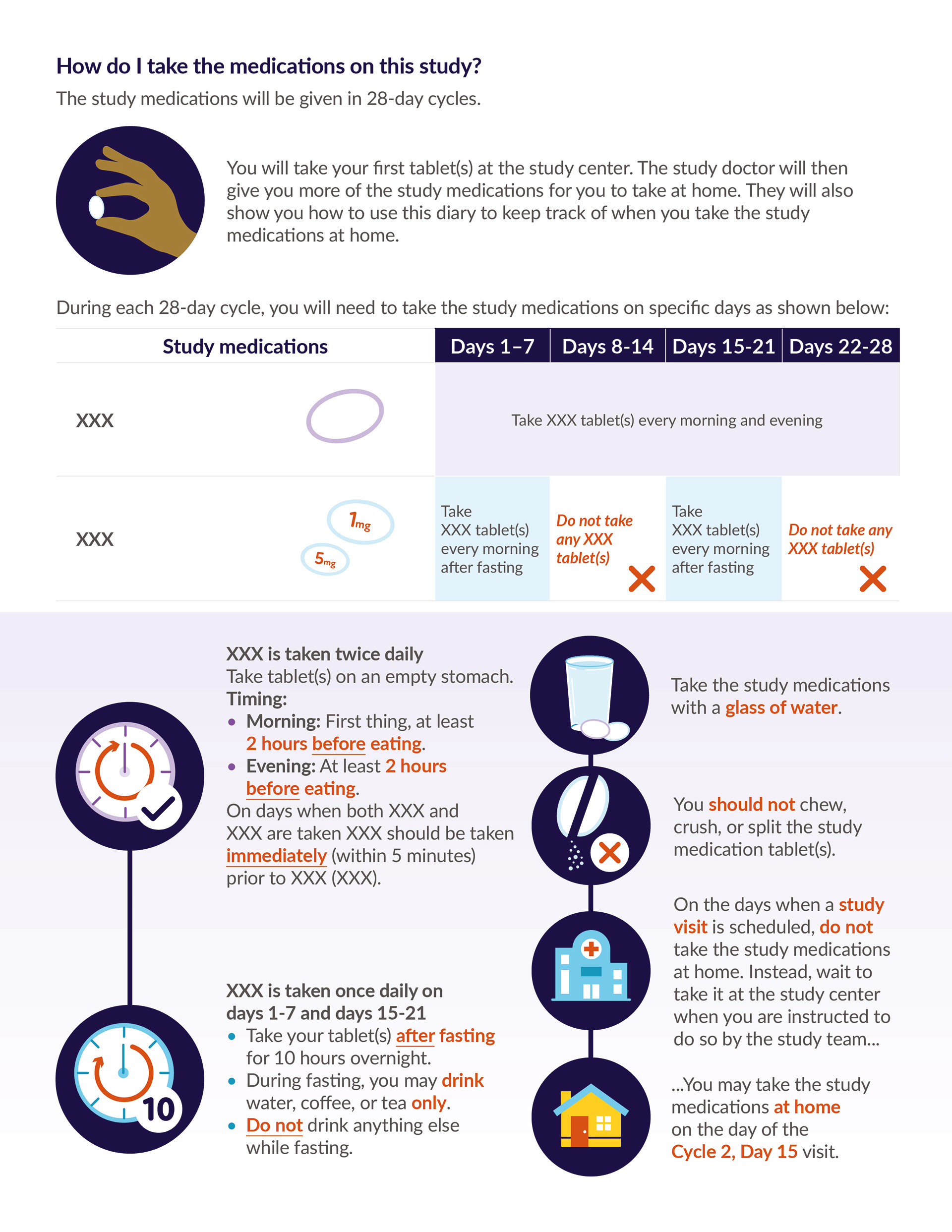
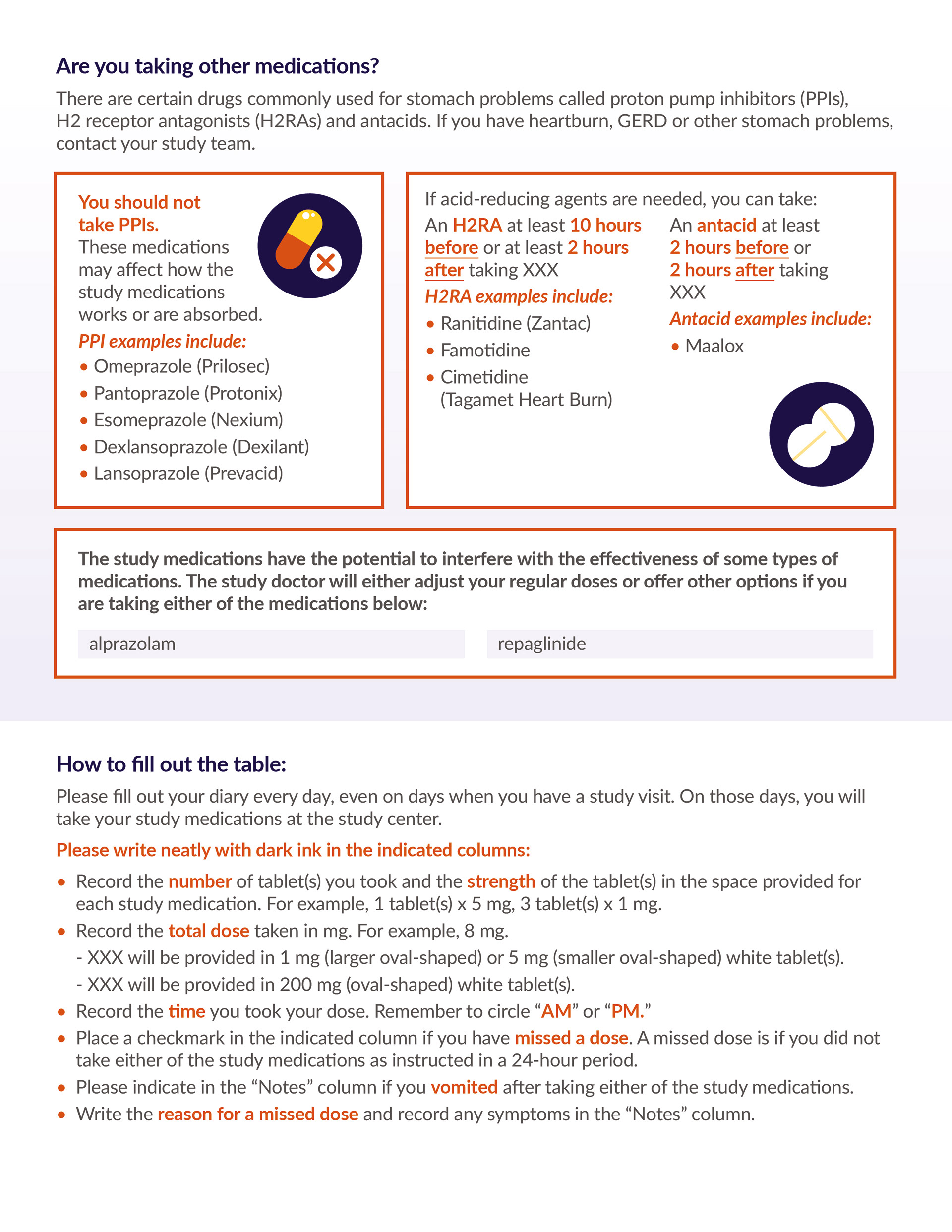
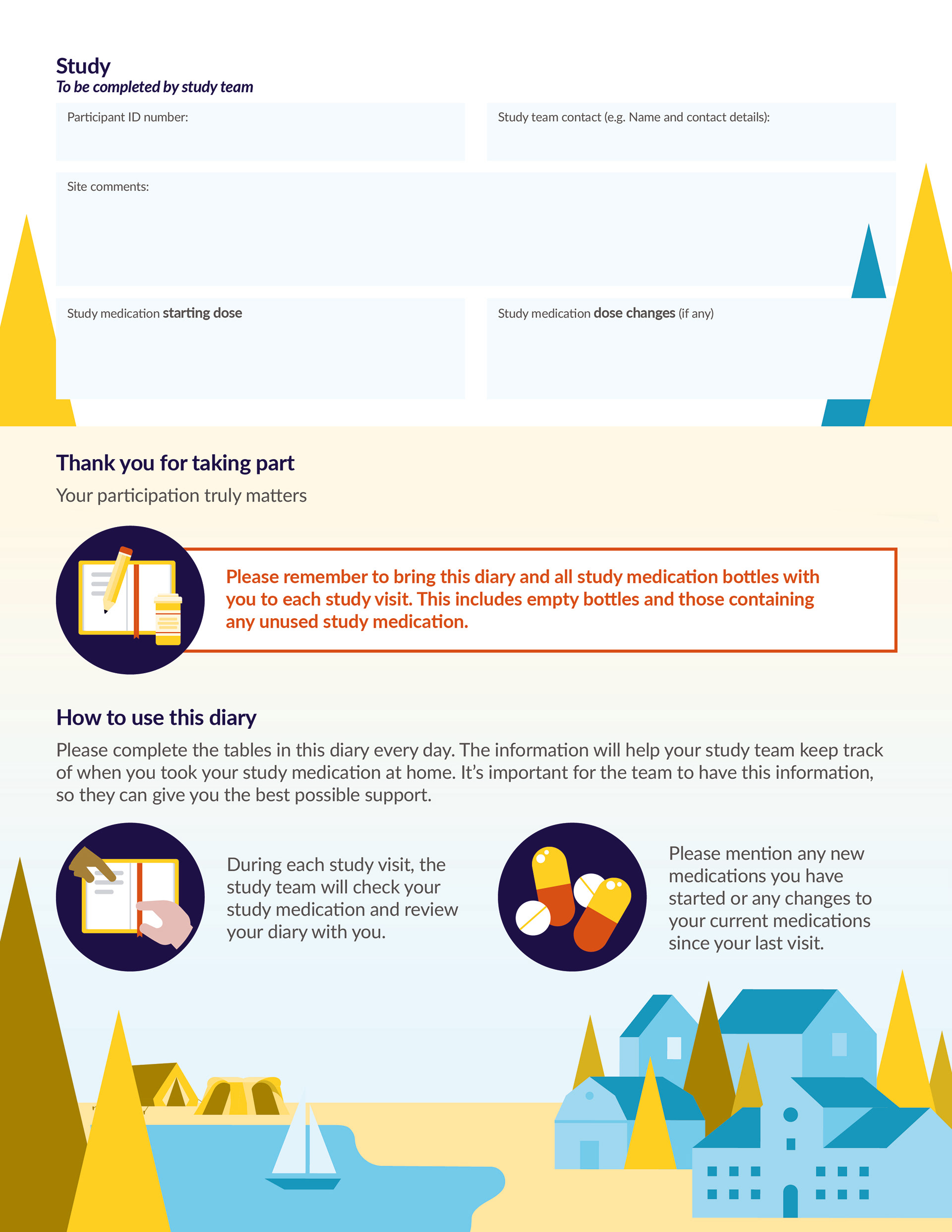
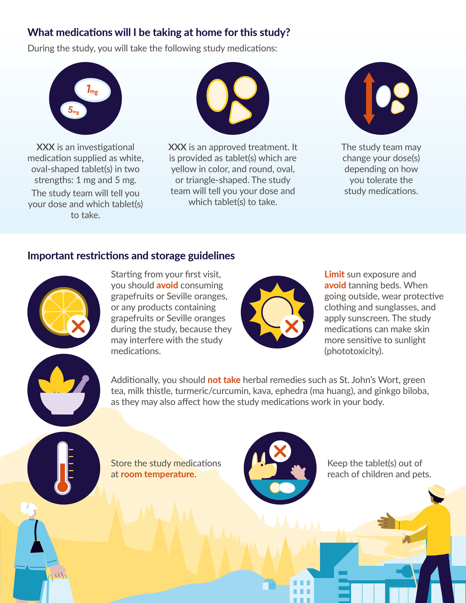
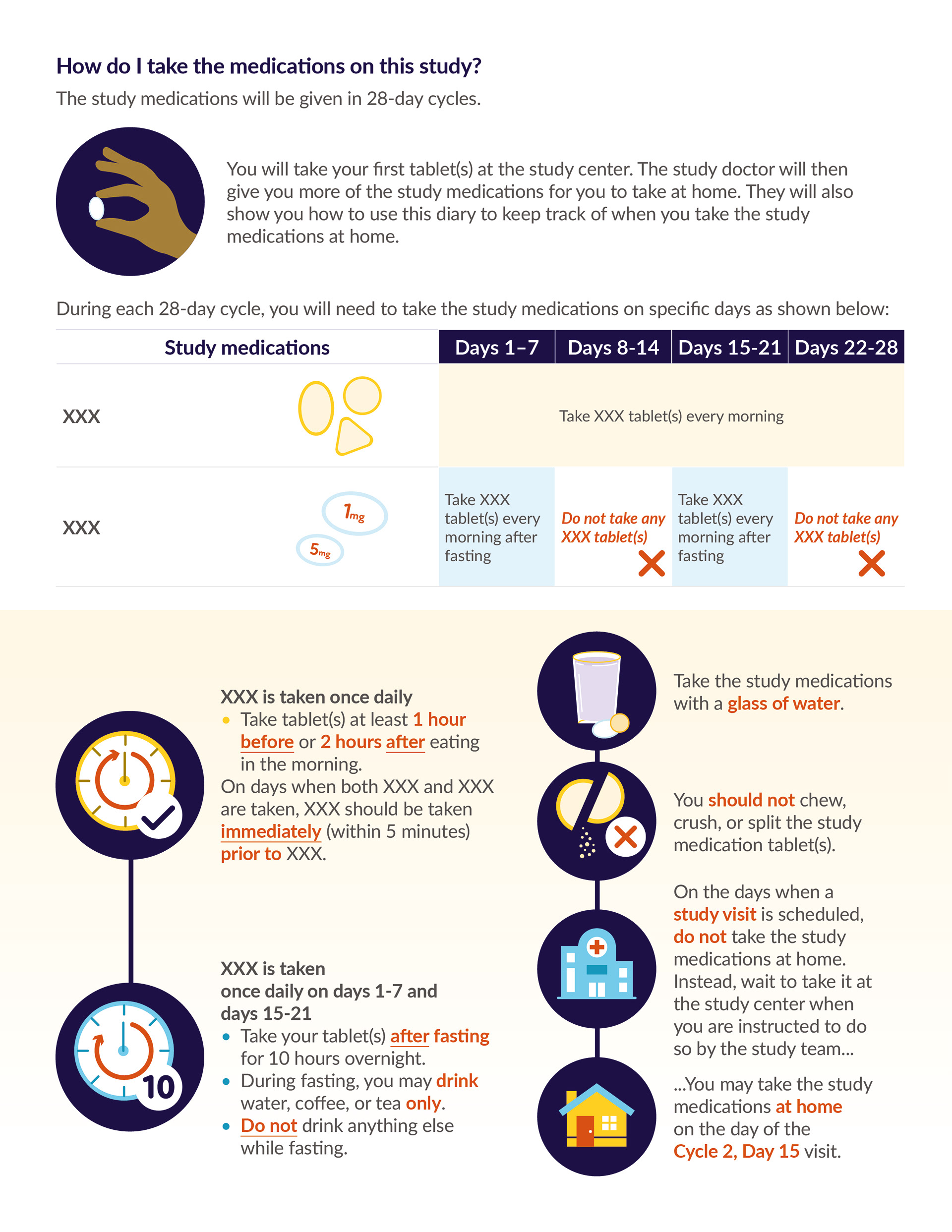
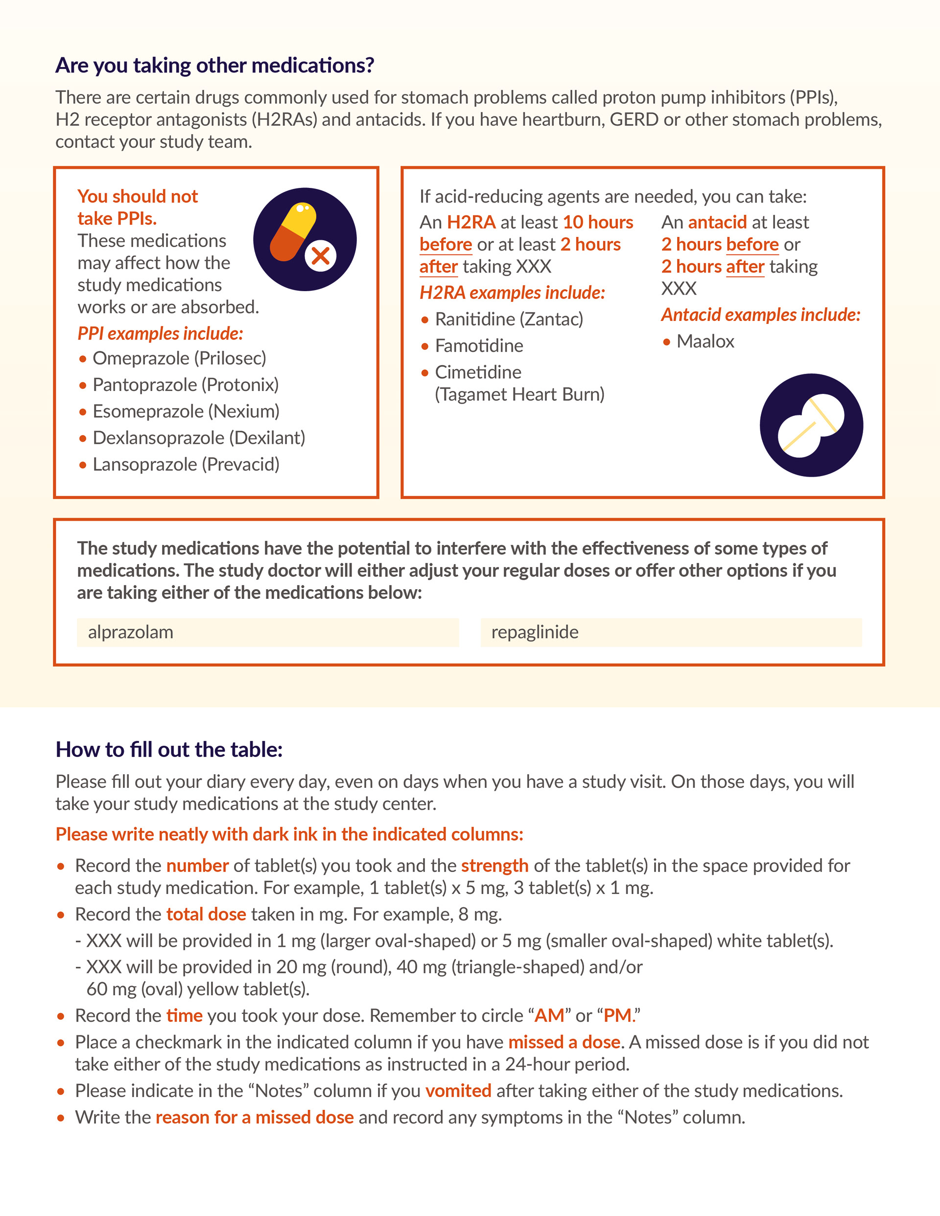
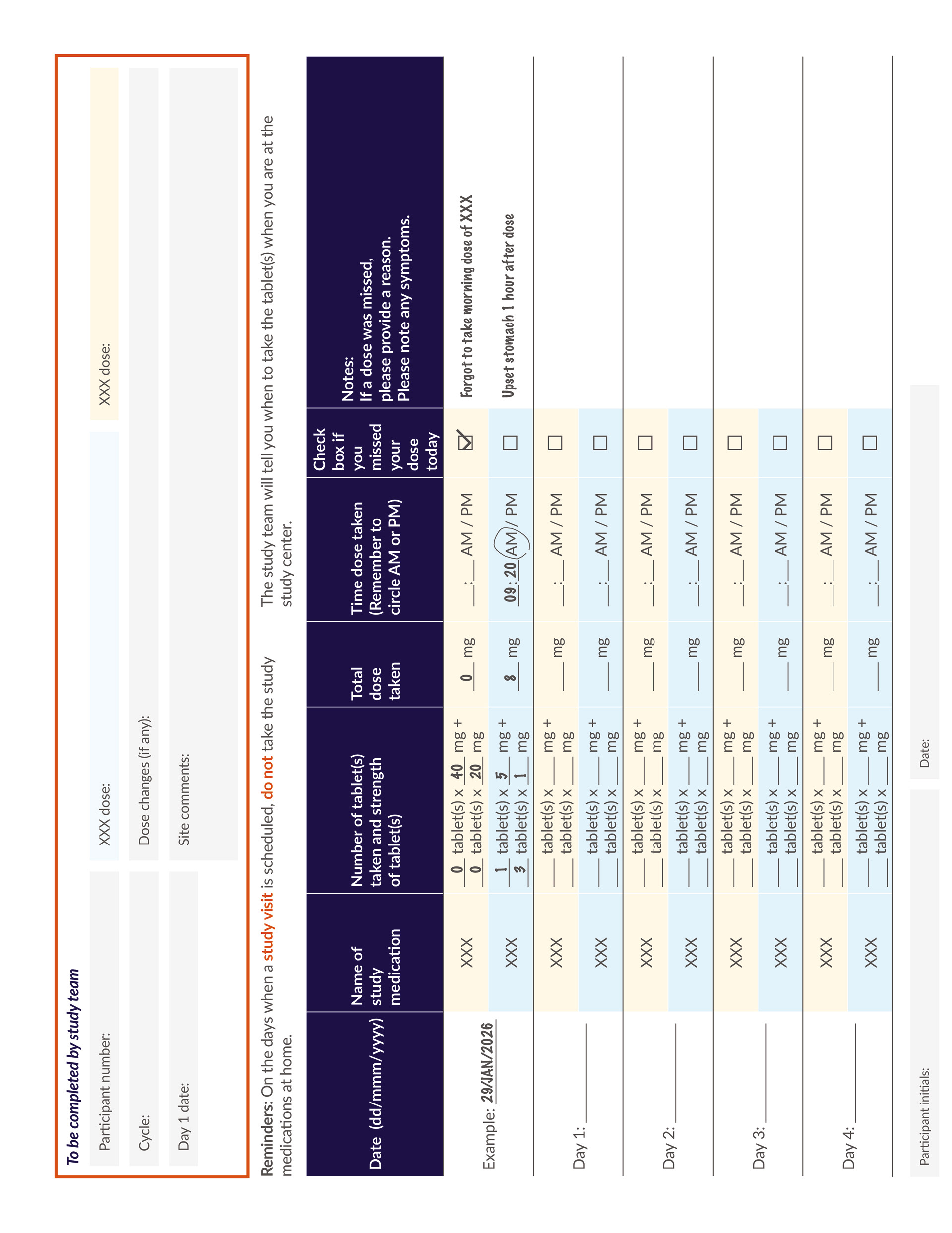
Alongside the illustrations, I carefully structured the information using clear typography, icons, colour coding and generous white space. My aim was to reduce the intimidating nature of clinical information and jargon by breaking up dense content into manageable sections, allowing participants to quickly identify key instructions without feeling overwhelmed. The illustrations also acted as moments of visual relief, helping the diaries feel approachable and encouraging participants to engage with it throughout the study. Patient-centricity was key for this brief and having the diaries designed as a companion rather than clinical booklet was really important.
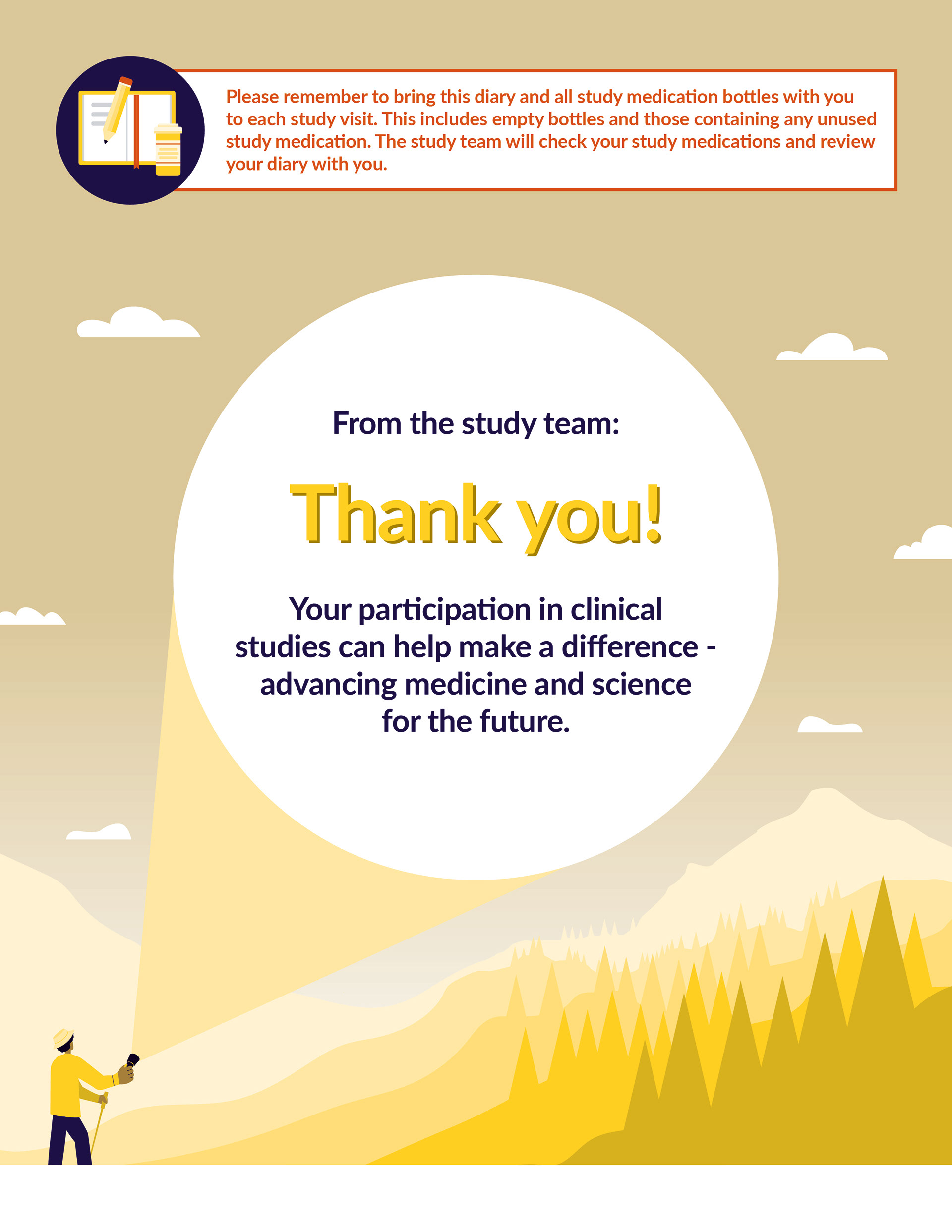
The final diaries transformed complex clinical information into a clear, approachable material that balanced regulatory requirements with a patient-centred design approach. The illustrated concept and visual identity were subsequently rolled out across more than ten supporting collateral pieces, including participant ID cards, newsletters, agendas and an interactive Jeopardy-style game, ensuring a consistent experience throughout the study.
The diaries were also further translated into five languages, requiring careful adaptation of layouts while maintaining visual consistency and usability. This project strengthened my skills in information design, editorial design, illustration and developing scalable design systems for complex, highly regulated environments.
The diaries were also further translated into five languages, requiring careful adaptation of layouts while maintaining visual consistency and usability. This project strengthened my skills in information design, editorial design, illustration and developing scalable design systems for complex, highly regulated environments.